


Your Opinion Requested
Cover Reveal (?) for the Paradox Box Set

Even though I’m shifting my efforts from prose novels to graphic novels, there is still some literary business that will need attending to from time to time. Right now, that business comes in the form of assembling the Paradox Series into a digital “box set.”
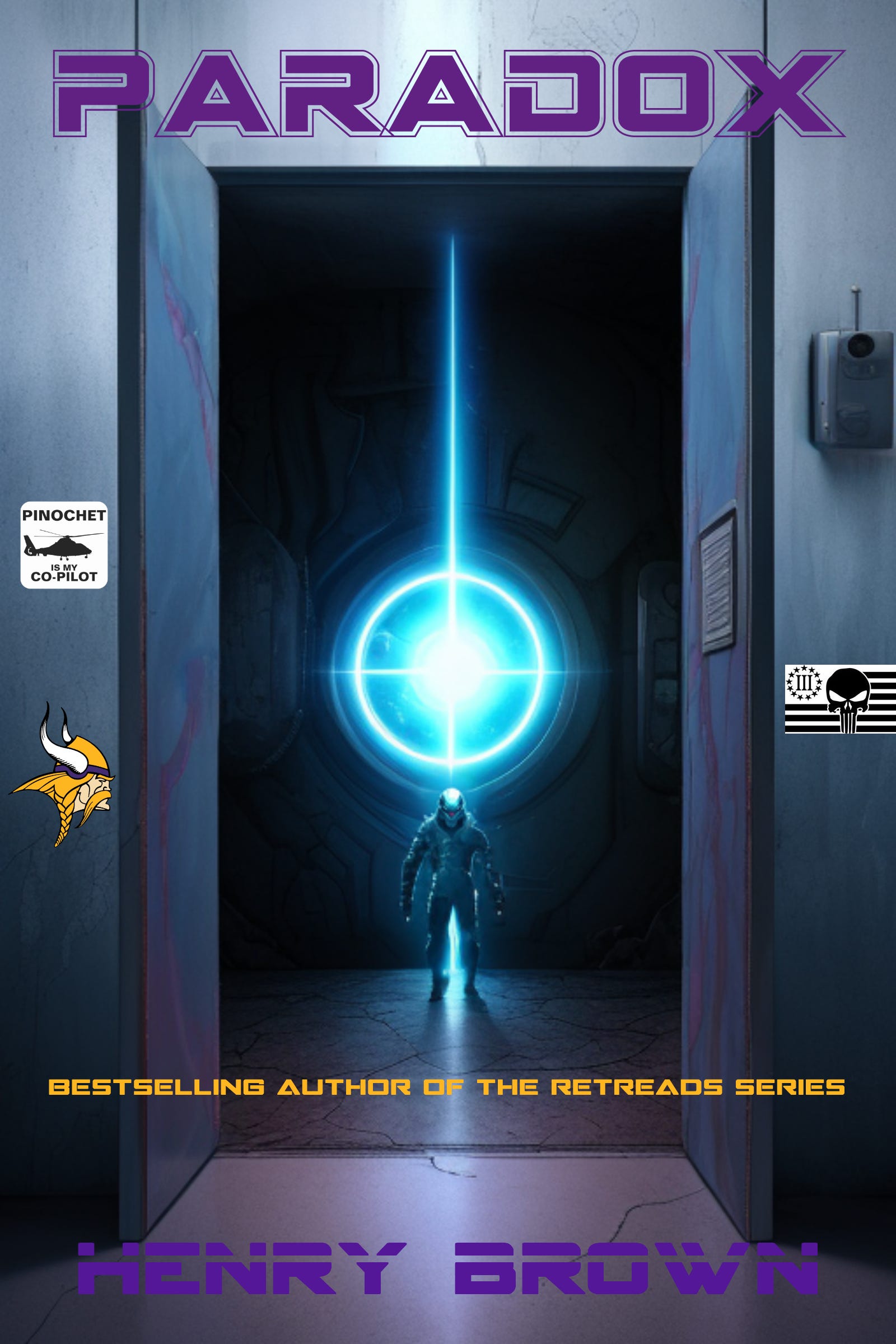
The Box Set will need a book cover. It should not be the same exact cover image from one of the individual books in the series, sez I. So this is what I initially cooked up:
Seems like that empty space in the top half throws the whole cover off balance. So I decided to fill the empty space with some review quotes. This is what that looks like:
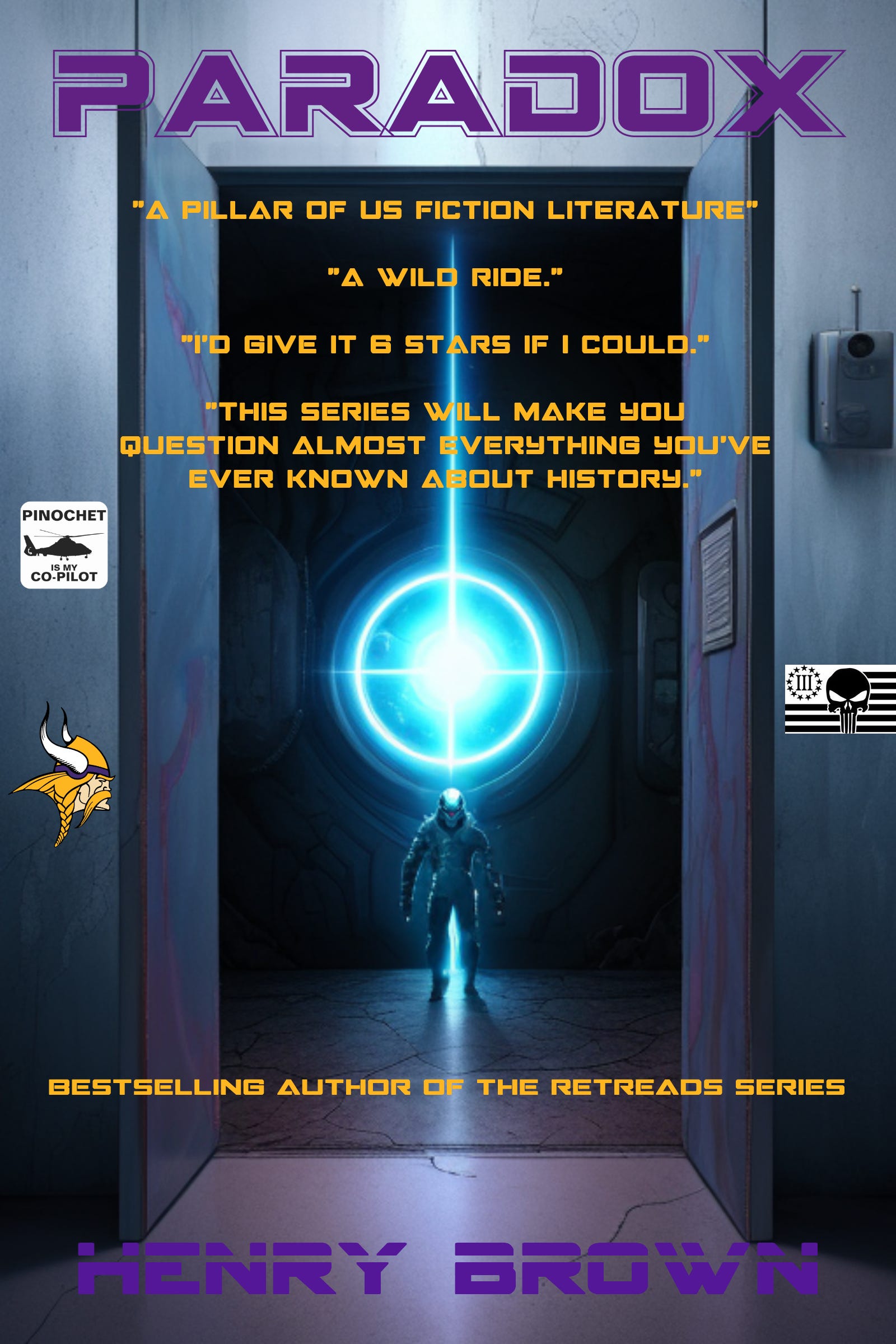
Something about this one looks…whack. Should the quotes be smaller so that they fit completely inside the doorway? Should they be there at all/is the empty space fine? I can’t quite define what it is that bothers me about it, but something about the quotes is ugly.
What do you think? What would look better than either of these covers? Your feedback is appreciated.
Perhaps have the quotes all in different font sizes? Some smaller and some bigger?