


Some Cover Variants
Alternate Layouts for the Default GN Cover

I got some good feedback on the rough draft cover reveal last time, and have come up with some different designs based on them.
First up is my most throwback cover. I’ve tweaked the issue title, but the biggest tweak is putting the logo in a box—and the issue number along with a tentative (optimistic?) publish date.
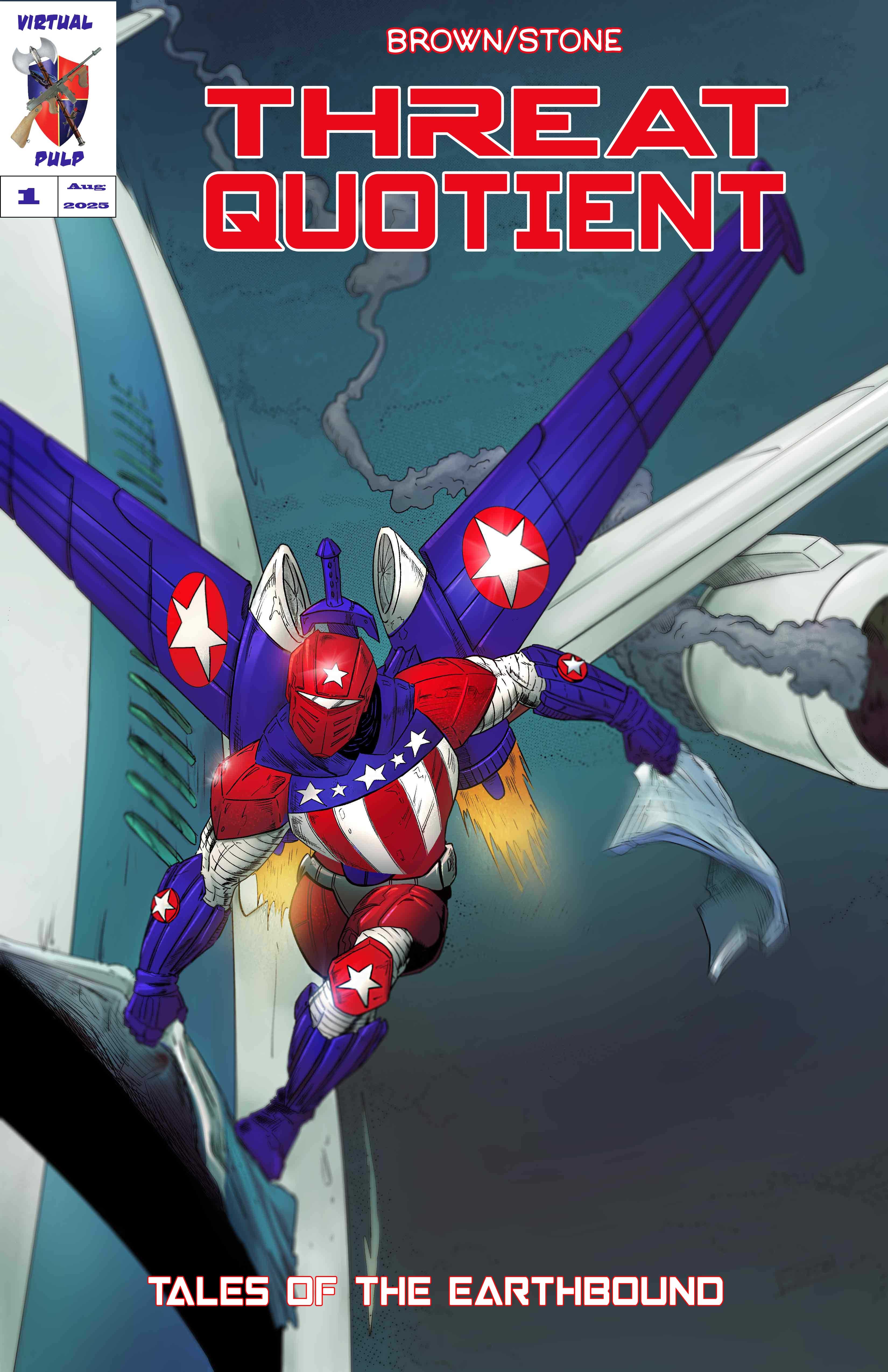
I can change the color from white if that will look better. And surround the whole box with a black line, if this is the best look. But I’ll wait for further comments rather than save/post a million different tweak versions.
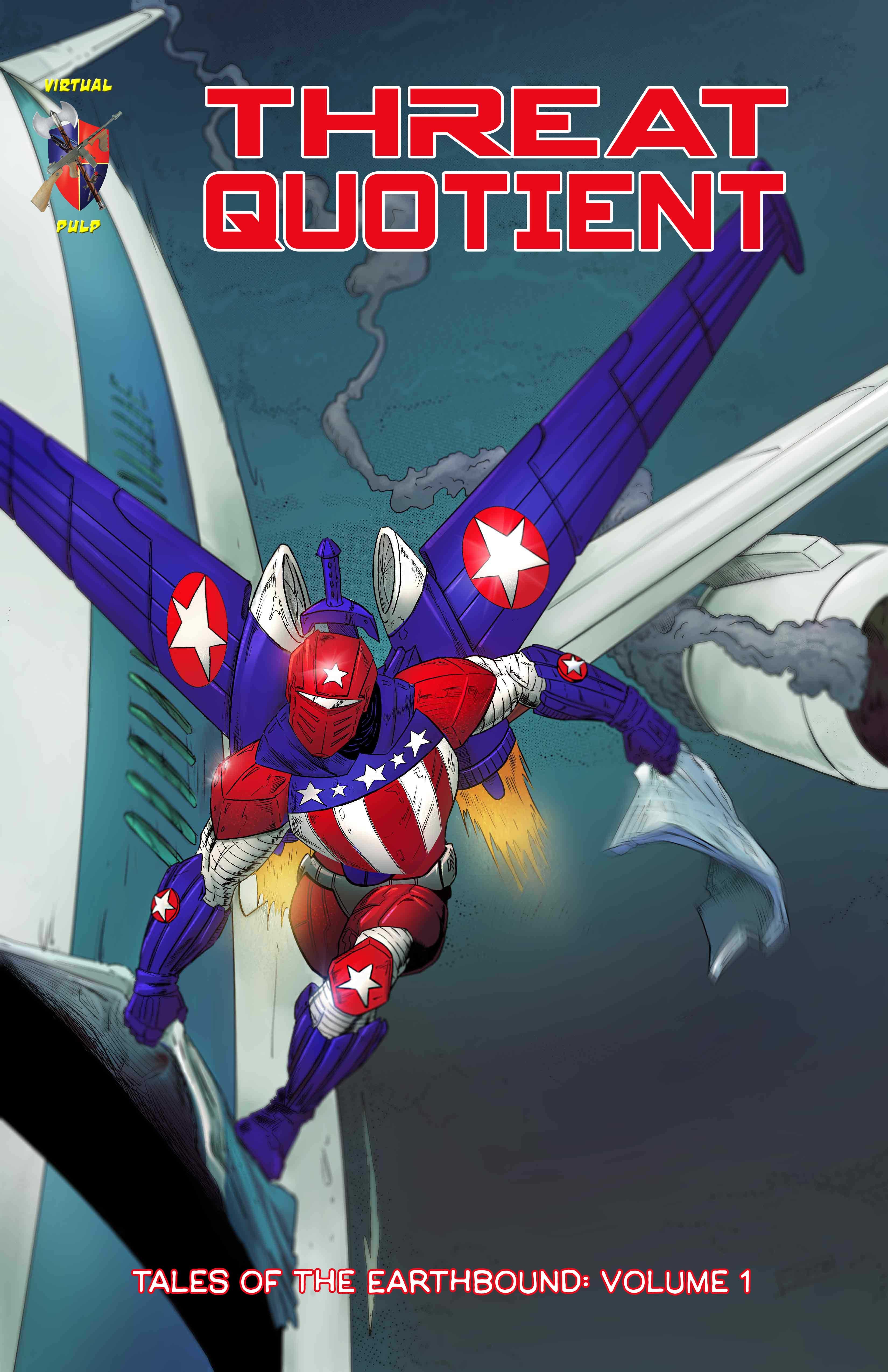
Here’s a very similar version, without the boxed logo:
Thanks to
for his advice about the leading.I have
to thank for the suggestion to separate the two words in the issue title with a line, like a fraction or quotient:
Having previously considered placing the series title inside a bar or strip, I decided to put it inside that fraction line for giggles:

And here I put the creator names up there instead:

I don’t want to make anybody sick of the cool artwork, and so will refrain from posting more tweaks until I’m ready to reveal the alternate cover. Thanks to everybody who has shared their thoughts, or will.
I like the boxed logo better. It brings back that wholesome old-school comic book vibe. The unboxed logo looks sterile and dull.